Modernization Feedback - CMHLG
Answered
To whom it may concern,
We have a few points to mention after 2 weeks of using the new dashboard.
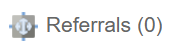
1. Our administrative assistants have pointed out that they can’t see the number of referral in the new dashboard, and they need to toggle to the old view to see the number of referrals at a glance. Old vs. new version of the dashboard pictured below:

2. Additionally, staff have identified that the colours assigned to each type of document on the left are not "different enough" so they kind of blend when there's a bunch together when it's on a small screen. Yellow / Pink / Blue / Orange for example might work better. Is it possible to add a high contrast view with different colors?
3. We have privacy/snooping concerns with the hover option for case notes? Does the system track who "hovered" over a case note to read it? Related to this, the main dashboard is also missing the private mode toggle like the old version had.

4. Is there a way for clinicians to have clients who are "active" show up in a different color.
Thanks,
Lean
-
Official comment

Hello Lean,
Thank you so much for taking the time to share such thoughtful and detailed feedback after using the new dashboard. We really appreciate you consolidating the input from your team; it’s incredibly helpful as we continue to refine the modernized experience. I’ll respond to each of your points below.- Adding the number of referrals in brackets to the global Referrals tab for the modernized view is planned. This update will be announced in future release notes when it is completed.
- Thank you for calling out the contrast concerns, especially for smaller screens. I’ve forwarded the suggestion around higher-contrast colour options (or a high-contrast view) to our development team for consideration.
- At this time, the system does not audit or track when a user hovers over an item, such as a case note. The absence of the Private Mode toggle in the modernized dashboard has also been noted, and this functionality is planned for a future update. Both points have been shared with our development team.
- Can you please clarify what you mean by "active" clients? For example, are you referring to clients with at least one program history in Receiving Services status? Additionally, where are you referencing the colour distinction to appear - within scheduled appointments, or within completed Contacts, Case Notes, or Case Data on the dashboard?
- Could you clarify where, on the classic dashboard, you're referring to clinicians previously seeing that case notes were authenticated?
- Thank you for the suggestion regarding collapsing multiple items of the same type on the calendar (e.g., “Case Note (6)”). I’ve forwarded the idea of offering a toggle between grouped and detailed views to our development team.
And lastly, thank you for sharing the positive feedback about the hover snapshot feature! We’re glad to hear that staff are finding it useful, and we appreciate you passing that along.
We'll be creating a support ticket to follow up with you directly on a few of the clarification points above. Thanks again for your continued engagement and support as we modernize the platform.
-
Some additional points.
5. Clinicians cannot see if case notes are authenticated anymore. They could see a summary previously, but now they need to select case notes in the tab on the left below the calendar which is additional clicking compared to before.
6. The previous view collapsed multiple of the same items on the calendar (i.e., Case note (6), vs Case note 78345, Case note 98753, etc.). Calendars can look very cluttered because of this. If there is some way to toggle for either view that would be great!
One note of appreciation from staff that they shared was for the snapshot when you hover over items. Just wanted to share that too!
Thanks,
Lean0
Please sign in to leave a comment.
Comments
2 comments